

Glyph Meaning: Definition, Uses & Examples
A glyph is a visual form used to represent a character, symbol, idea, sound, or piece of information. You encounter glyphs constantly when reading a book, typing on a keyboard, checking a website, or looking at icons on a phone. Letters, numbers, punctuation marks, mathematical symbols, and many writing-system signs can appear as glyphs when they are given a visible shape. Although the term is strongly associated with typography and digital fonts, its meaning extends into linguistics, archaeology, graphic design, computing, and user-interface design. Understanding glyph meaning becomes especially useful when discussing fonts, Unicode characters, ancient scripts, symbols, and digital text rendering. In simple terms, a glyph is what a character or symbol actually looks like when it is displayed.
The idea can initially seem confusing because people often use words such as character, symbol, icon, and glyph interchangeably. Technically, however, these terms describe related but different concepts, especially in typography and computing. A character is generally an abstract unit of information, while a glyph is the visible representation used to show that character. One character may therefore have several possible glyphs depending on the font, writing style, language, or context in which it appears. The lowercase letter “a,” for example, can look noticeably different across typefaces while still representing the same alphabetic character. Learning this distinction makes it easier to understand how modern fonts, writing systems, and digital displays transform abstract information into readable visual forms.
What Is a Glyph?
The simplest glyph definition is a visual representation of a character, symbol, or meaningful mark. When you see a printed letter on a page, the particular shape used to draw that letter can be considered a glyph. A glyph does not necessarily represent an alphabetic letter because numbers, punctuation marks, mathematical signs, currency symbols, and other graphical marks can also have glyph forms. The word is especially useful when discussing how information is visually represented rather than what the underlying information means. For instance, the concept of the letter “B” is a character, while its precise appearance in Arial, Times New Roman, or another typeface is a glyph. This distinction separates visual appearance from the abstract identity behind the mark.
The meaning of glyph becomes clearer when you think about handwriting and typography together. Several people can write the same letter using noticeably different shapes, curves, proportions, and strokes without changing the identity of that letter. Similarly, different fonts produce different graphical forms for the same character while readers continue to recognize the intended letter. These visible variations demonstrate why a glyph is best understood as a representation rather than the character itself. Typography software may contain multiple glyphs associated with one character to provide stylistic alternatives, language-specific forms, or contextual versions. Designers can choose among these forms to create a particular visual tone while preserving the underlying text. This makes glyphs fundamental to both communication and visual design.
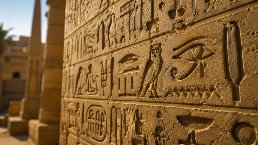
The term glyph has historical associations as well as modern technical uses. Ancient civilizations communicated through carved, painted, or written signs that represented sounds, objects, ideas, people, events, or combinations of meanings. Hieroglyphic writing is perhaps the example most people immediately recognize, although glyph-like visual signs appear across many historical writing traditions. Archaeologists and linguists study these marks to understand how earlier societies recorded language and communicated information. In this context, a glyph may describe a meaningful graphic sign within an ancient writing system rather than a computer-generated font shape. Modern typography has given the word a more specialized technical meaning, but the basic connection to meaningful visual representation remains. That continuity explains why the term appears across both historical and digital discussions.
A glyph can also represent information without functioning like a conventional alphabetic letter. Consider a mathematical plus sign, an arrow, a musical notation mark, or a currency symbol displayed on a screen. Each has a recognizable visual shape that allows readers to interpret the information quickly. In many technical environments, software stores information about a character separately from instructions describing how its glyph should appear. The rendering system then uses the selected font and formatting conditions to generate the appropriate graphical representation. This process happens automatically whenever digital text is displayed, printed, resized, or styled. Although users rarely notice the underlying mechanism, glyph rendering plays a major role in making digital communication readable and visually consistent.
Understanding what a glyph means therefore requires separating appearance from identity. The identity may be a letter, number, punctuation mark, linguistic character, or another encoded element, while the glyph supplies its visible form. This difference becomes particularly important when one character has several visual forms or when one visual shape can serve different purposes in different contexts. Fonts, languages, and writing conventions can all influence which glyph appears on the page or screen. A good working definition is that a glyph is the concrete visual form through which an abstract character or symbol becomes visible. Once that idea is understood, concepts such as font glyphs, Unicode characters, ligatures, alternate forms, and digital typography become considerably easier to understand.
Glyph vs. Character, Symbol, and Icon
A glyph and a character are closely connected, but they are not exactly the same thing. A character represents an abstract unit used in written communication, such as a letter, digit, or punctuation mark. A glyph is the graphical form that visually represents that character in a particular font or writing environment. Imagine typing the capital letter “A” and then changing the font several times without changing the actual text. The stored character remains the same even though its visible shape, thickness, proportions, serifs, and decorative details may change dramatically. Each visual realization can be treated as a different glyph representation of the same underlying character, which is why character encoding and typography are separate layers in digital text systems.
The difference between a glyph and a symbol depends partly on context because the term symbol has a broader everyday meaning. A symbol is generally something that represents an idea, concept, operation, object, relationship, or meaning beyond its physical appearance. A heart shape can symbolize love, while a mathematical symbol can indicate an operation such as addition or equality. When that symbol is rendered using a specific visual design, its visible form may be described as a glyph. In other words, symbol describes what a mark represents, whereas glyph often emphasizes the specific graphic form used to display it. The two concepts can overlap, but distinguishing them becomes useful in typography, font development, software engineering, and digital publishing.
Glyph and icon are also related concepts, particularly in modern interface design, but they are not automatically interchangeable. An icon is typically a graphical element designed to represent an action, object, feature, status, or navigation option within an interface. A magnifying glass can represent search, a trash can can indicate deletion, and a house-shaped graphic can represent a home page. Some icons are stored and rendered as glyphs inside icon fonts, which is one reason the terminology sometimes overlaps. However, many icons are independent vector graphics, images, or interface components rather than font glyphs. A glyph is fundamentally a graphical form associated with a writing or symbol system, while an icon is usually designed primarily to communicate interface functionality or meaning visually.
Another useful distinction involves graphemes, which are abstract units in writing systems that can distinguish meaning. A grapheme may correspond to a letter, combination, or other meaningful written unit depending on the language being analyzed. A glyph, by comparison, describes how such an element is actually drawn or displayed. Linguistics therefore focuses heavily on the functional role of written units, whereas typography pays closer attention to their visible shapes. The relationship becomes more complicated in scripts where letters change form depending on their position within a word. In those cases, one underlying character or grapheme may be displayed using different contextual glyphs. This flexibility demonstrates why visual appearance cannot always be treated as identical to linguistic identity.
These distinctions matter because digital communication depends on several layers working together correctly. Software must know which character a person typed, which encoding represents it, which font contains a suitable glyph, and how that glyph should be positioned on the screen. A designer may focus mainly on the shape of the visible letter, while a developer may need to understand the encoded character beneath it. A linguist may instead examine the written unit and its relationship to language structure. All three professionals can be discussing the same displayed mark from different perspectives. Recognizing that glyph, character, symbol, icon, and grapheme describe different aspects of visual communication helps prevent confusion when working with typography, websites, apps, fonts, international languages, and digital content.
How Glyphs Work in Typography and Fonts
Typography is one of the most common areas in which the term glyph is used precisely. A digital font contains graphical information that tells software how letters, numbers, punctuation marks, and other supported characters should appear. These graphical forms are stored as glyph designs containing curves, outlines, proportions, spacing information, and other typographic details. When a user types text, software identifies the required characters and determines which glyphs from the selected font should represent them. A rendering engine then positions those glyphs according to typographic rules before displaying or printing the result. This seemingly simple process allows the same text to appear dramatically different when different typefaces are selected, even though the underlying words and characters have not changed.
One font may contain far more glyphs than the number of characters a typical user sees on a keyboard. Designers often include uppercase letters, lowercase letters, accented characters, punctuation, mathematical symbols, currency marks, ligatures, fractions, alternate numerals, and stylistic variations. Professional typefaces may also support several languages and therefore contain thousands of individual glyph designs. Some characters can even have several available glyphs so users can select alternative shapes without changing the underlying text. These alternatives might include decorative capitals, swashes, old-style numerals, stylistic sets, or language-specific forms. This large glyph inventory gives designers greater creative control while allowing the font to support diverse communication needs. Font quality therefore depends partly on both glyph design and glyph coverage.
Ligatures provide a particularly useful example of how glyph behavior can extend beyond a simple one-character-to-one-glyph relationship. A ligature combines two or more characters into a specially designed visual form when doing so improves appearance, readability, or traditional typography. Common examples in Latin typography involve combinations such as “fi” or “fl,” where neighboring letter shapes can otherwise collide awkwardly. The original characters still exist in the text, but the font-rendering system may substitute a combined glyph for visual presentation. Some ligatures are primarily functional, while others are decorative or stylistic. This process shows that glyph selection can depend on surrounding characters rather than only the identity of an individual character. Modern typography engines perform these substitutions automatically when the font and software support them.
Contextual glyphs are even more important in writing systems where letter shapes change according to their position. Arabic provides a familiar example because many letters have different visual forms depending on whether they appear independently or at the beginning, middle, or end of connected text. The underlying character does not necessarily change just because the displayed form changes. Instead, shaping software analyzes neighboring characters and selects appropriate glyphs from the font. Similar contextual behavior can appear in other scripts and sophisticated typographic systems. This means digital text rendering involves more than simply placing one isolated image after another. Font technologies and text-shaping engines cooperate to select, position, connect, and adjust glyphs so written language appears natural, legible, and culturally appropriate.
Glyph metrics also influence how text looks even when readers never notice them directly. Every font must define information such as a glyph’s width, side bearings, baseline relationship, vertical dimensions, and positioning behavior. Kerning adjustments can modify the spacing between particular pairs of glyphs so combinations appear visually balanced rather than mechanically spaced. Marks such as accents may require careful positioning relative to base letters, while complex scripts may require multiple glyphs to interact within a compact area. Poor glyph metrics can make an otherwise attractive typeface difficult to read or visually uneven. Well-designed metrics support rhythm, legibility, and consistency across paragraphs, headings, buttons, and interfaces. Typography therefore depends not only on attractive glyph shapes but also on precise rules controlling how those shapes interact.
Glyphs in Writing Systems and Languages
Glyphs are fundamental to written language because every writing system needs visible forms through which information can be communicated. Alphabetic systems use graphical forms for letters, while other systems may use characters representing syllables, words, grammatical elements, or combinations of sounds and meanings. The visual complexity of a glyph varies enormously between scripts and individual writing traditions. Some marks consist of only a few strokes, whereas others contain intricate structures that must be arranged within a defined space. Despite those differences, the underlying principle remains similar: readers interpret visible forms according to learned linguistic conventions. Studying glyphs therefore provides insight into how human societies convert spoken language, meaning, and abstract information into durable visual systems that can be read and reproduced.
Latin-script languages offer straightforward examples because many readers recognize the familiar alphabet immediately. Even within this writing system, however, glyph diversity is greater than it might initially appear. Letters can include accents, diacritics, language-specific marks, uppercase forms, lowercase forms, and stylistic alternatives. The appearance of the same basic letter can also vary widely among serif, sans-serif, handwritten, decorative, and monospaced fonts. Readers generally recognize these different glyph shapes because they preserve enough structural features to remain identifiable. When a font becomes excessively decorative or unconventional, recognition can become slower because those expected visual cues are weakened. This relationship between variation and recognizability is one reason typography must balance creativity with practical readability.
Logographic and character-rich writing systems demonstrate the importance of broad glyph coverage in digital fonts. A font intended to support such languages may require a very large collection of carefully designed characters and graphical forms. Consistency becomes a significant design challenge because thousands of glyphs must share compatible stroke weights, proportions, spacing, and visual style. A font that supports only part of the required character set may cause missing-character indicators when users attempt to display unsupported text. This problem is sometimes represented by an empty square or another placeholder shape. The issue does not necessarily mean the text itself is damaged because the correct character information may still exist underneath. Instead, the active font or rendering environment may simply lack the glyph needed to display it properly.
Diacritics provide another illustration of the relationship between language and glyph construction. Marks placed above, below, through, or beside letters can change pronunciation, stress, meaning, or grammatical function depending on the language. A font designer must ensure that these marks are sized and positioned correctly across many base characters. In digital typography, some accented characters may have dedicated glyphs, while others can be produced by combining a base character with a separate combining mark. The final visual result should still appear natural to the reader regardless of how the underlying text is encoded. Incorrect placement can make words look unprofessional or even create confusion in languages where diacritics carry important linguistic information. High-quality multilingual typography therefore requires careful attention to both character support and glyph behavior.
Glyphs also reflect cultural history because writing systems develop through centuries of artistic, technological, and practical change. Handwritten forms may evolve when writing tools, materials, or educational traditions change, while printed forms can shift as printing technologies improve. Digital typography has introduced another stage by requiring writing systems to function across phones, computers, websites, applications, and variable display environments. Designers must preserve recognizable cultural and linguistic characteristics while adapting glyphs for screens of many sizes and resolutions. This work is especially important for scripts that were historically underserved by early digital technologies. Better multilingual font development now helps more languages appear correctly and attractively across digital platforms. Glyph design is therefore not merely aesthetic; it contributes to linguistic accessibility and inclusive communication.
Glyphs in Computers, Unicode, and Digital Text
Computers handle text by separating the meaning of encoded characters from the graphical forms displayed to users. When you type a character, the system generally stores a numerical representation rather than saving a picture of the letter you see. Character-encoding standards allow software to identify these abstract units consistently across devices and applications. A font then provides the glyph or glyphs needed to render the stored characters visually. This separation makes it possible to copy text from one application to another and change its font without changing the words themselves. It also allows search engines, screen readers, databases, and other technologies to process textual information based on characters instead of relying purely on appearance. Modern digital communication depends heavily on this distinction.
Unicode plays a major role in organizing characters used across modern computing systems. It assigns standardized code points to a vast range of letters, numbers, punctuation marks, writing-system characters, technical symbols, and other textual elements. A Unicode code point identifies an abstract character rather than prescribing exactly how that character must look in every font. Font designers create corresponding glyphs while maintaining the distinctive visual style of their typeface. Consequently, the same Unicode character can look somewhat different on different operating systems, websites, or devices. The underlying identity remains stable even when the graphical presentation changes. This arrangement supports worldwide text exchange while still allowing designers substantial flexibility in typography, appearance, and branding.
A missing glyph appears when software knows which character should be shown but cannot find an appropriate graphical form in the available font. Users may then see an empty rectangle, outlined box, replacement character, or another placeholder instead of the intended symbol. Typography professionals sometimes informally describe this missing-character box as “tofu” because its rectangular appearance resembles a small block. The problem commonly occurs when a font lacks support for a particular language, symbol, historic script, or specialized technical character. Changing to a font with broader character coverage often solves the display problem without changing the underlying text. This distinction is useful when troubleshooting websites, documents, applications, and imported data containing multilingual or uncommon characters.
Text shaping makes glyph rendering considerably more sophisticated than simply matching every character with one predefined image. The shaping engine considers information such as script rules, character order, neighboring letters, ligatures, combining marks, and directionality before selecting and positioning glyphs. This is particularly important for complex scripts where characters interact or change visual form according to context. Fonts can contain special layout instructions that tell compatible software how these transformations should work. If either the font or rendering technology lacks adequate support, text may appear disconnected, incorrectly positioned, or difficult to read. Modern browsers and operating systems perform these processes quickly enough that users normally never notice them. Behind every correctly displayed line of multilingual text, however, substantial glyph-processing logic may be operating.
Digital glyph technology continues to evolve as typography becomes more flexible and expressive. Variable fonts can store multiple design variations within a single font file, allowing properties such as weight, width, or optical size to change along continuous ranges. Color font technologies can support multicolored glyphs, which are particularly relevant for emoji and decorative typography. High-resolution displays have also allowed designers to create extremely detailed forms while still maintaining crisp rendering. At the same time, responsive design requires glyphs to remain legible on everything from watches and phones to desktop monitors and large screens. These developments demonstrate that glyphs are not outdated typographic concepts. They remain central components of modern interfaces, branding systems, digital publishing, accessibility, and global communication.
Common Glyph Examples You See Every Day
Alphabetic letters provide the easiest examples of glyphs because people encounter them continuously while reading and writing. Consider the lowercase letter “g,” which can appear in noticeably different forms depending on the chosen typeface. Some fonts use a simpler single-storey shape, while others use a more complex double-storey construction. Both versions can represent the same lowercase character even though their glyph designs are visibly different. Similar differences occur with letters such as “a,” where handwritten and printed forms may use different structures. These examples clearly show why a glyph should not be defined simply as a character. The character supplies the abstract identity, while its glyph determines the particular visual representation presented to the reader.
Numbers and punctuation marks are also common glyph examples, even though people may not immediately think of them in that way. The numerals from zero through nine require visual forms within a font just as alphabetic letters do. Professional fonts may provide several numeral styles, including lining figures, old-style figures, tabular figures, and proportional figures for different design contexts. Punctuation marks such as commas, quotation marks, apostrophes, parentheses, and question marks also have unique glyph designs. Their proportions and positions influence the rhythm and readability of written material more than many readers realize. A poorly designed punctuation glyph can look awkward next to surrounding letters or interfere with spacing. High-quality typefaces therefore treat these seemingly small symbols with the same attention given to alphabetic characters.
Currency and mathematical signs offer another large category of everyday glyphs. Dollar signs, euro signs, pound signs, yen signs, plus signs, minus signs, multiplication marks, and equality symbols all require graphical representations within compatible fonts. Designers must make these glyphs visually consistent with surrounding numbers and letters so equations, prices, tables, and financial information remain easy to scan. A currency symbol that is too heavy or too narrow can disrupt the visual balance of numerical data. Mathematical typography can become considerably more demanding because complex equations require specialized symbols, operators, superscripts, subscripts, and carefully controlled positioning. Scientific and academic fonts may therefore contain extensive glyph sets specifically designed for technical notation. These examples illustrate how glyph design directly affects information clarity.
Arrows, interface symbols, and pictographic marks can also function as glyphs when they are included inside a font. A font might contain directional arrows, checkmarks, stars, geometric shapes, location symbols, or other visual signs assigned to particular characters or private-use positions. Icon fonts became popular in digital design because developers could style these symbols using familiar text properties such as size and alignment. Modern web development increasingly uses dedicated vector graphics for many interface icons, but glyph-based symbols still appear in numerous applications and operating systems. Whether a particular graphic should be called a glyph or icon depends on how it is implemented and used. If it exists as a graphical form within a font system, describing it as a glyph is generally appropriate.
Emoji provide an especially familiar modern example of the distinction between characters and visual glyphs. The same encoded emoji can look different on different platforms because companies and operating systems may provide their own graphical designs. Users recognize the underlying concept, yet differences in facial expressions, colors, details, or stylistic treatment can sometimes influence how the emoji feels. In this sense, the encoded emoji character behaves similarly to other textual characters, while each platform supplies its own visible glyph representation. Some emoji sequences are even created by combining multiple encoded elements into one displayed graphic. This demonstrates that character-to-glyph relationships can be considerably more complicated than they appear. Everyday messaging therefore provides millions of users with practical examples of glyph technology without requiring them to know the terminology.
Why Glyphs Matter in Design, Branding, and Usability
Glyph design has a direct effect on readability because people recognize words partly through familiar letter structures and visual patterns. When glyphs are clear and appropriately spaced, readers can process text quickly without consciously examining individual shapes. Poorly designed or overly decorative glyphs can slow recognition, especially in long passages or small interface text. This is why display fonts suited to large headlines may perform poorly when used for body copy. Designers must consider stroke width, spacing, proportions, counters, contrast, and other features when evaluating how well glyphs function at different sizes. Good typography rarely calls attention to every individual character because its visual system works smoothly as a whole. Effective glyphs support reading rather than forcing readers to decipher the typography.
Brand identity can also be shaped through distinctive glyph design. Organizations often select or commission typefaces whose letterforms communicate qualities such as professionalism, friendliness, precision, tradition, luxury, or technological sophistication. Small details in the shape of an “R,” “G,” numeral, ampersand, or punctuation mark can give a typeface a recognizable personality. Some brands modify individual glyphs or develop custom fonts to create a visual language that competitors cannot easily reproduce. These custom forms can appear across websites, packaging, applications, advertising, and physical environments. Consistent typography helps audiences associate a particular visual style with the organization even before they consciously notice the font. Glyphs therefore operate as small but influential components of larger branding systems.
Accessibility makes glyph quality even more important because visual ambiguity can create genuine barriers to understanding. Certain typefaces make characters such as uppercase “I,” lowercase “l,” and the numeral “1” look almost identical, which can cause confusion in passwords, codes, technical documentation, and everyday reading. Similar problems can occur with zero and uppercase “O” or with closely related punctuation marks. Accessible typography aims to provide sufficient differentiation while maintaining an attractive visual system. Font size, spacing, contrast, and layout also influence how easily individual glyphs can be recognized. People with visual impairments, reading difficulties, or cognitive accessibility needs may benefit especially from clearer character shapes. Choosing readable glyph designs is therefore a usability decision rather than merely an aesthetic preference.
Glyph consistency matters greatly in interface design because users interact with text and symbols while navigating digital products. Buttons, menus, navigation bars, notifications, data tables, search fields, and form controls all depend on clearly rendered textual information. If glyphs appear inconsistent across operating systems or unsupported characters become missing boxes, an interface can quickly feel unreliable or unfinished. Designers testing multilingual products must confirm that chosen fonts support the necessary languages and special characters. Developers also need fallback fonts so unsupported characters can be displayed correctly when the primary typeface lacks a particular glyph. These details may seem minor during development, yet they strongly influence the polish and credibility of the final product. Reliable glyph rendering contributes directly to a smoother user experience.
Glyphs additionally matter for search, data processing, and content management because visual similarity does not always mean computational equality. Two marks can look nearly identical while representing different encoded characters, potentially creating problems in usernames, URLs, databases, copied text, and security-sensitive information. Conversely, one character may appear through different glyph forms without changing its encoded meaning. Content creators and developers therefore need to distinguish visual presentation from the text data underneath it. This is especially important when handling international content, special symbols, mathematical notation, or text copied from multiple sources. Understanding glyph meaning provides a useful conceptual foundation for recognizing these differences. It helps bridge the gap between what humans visually perceive and how computers actually store and process written information.
How Glyphs Are Created and Designed
Creating a professional glyph begins with understanding the visual principles of the typeface or symbol system it belongs to. A type designer typically establishes fundamental characteristics such as stroke thickness, proportions, curves, terminal shapes, contrast, x-height, and overall visual personality. Individual letters are then designed so they appear unique enough to be recognized while remaining consistent with the rest of the font. Designing one attractive character is relatively easy compared with creating hundreds or thousands that function as a coordinated system. Every glyph must work beside many possible neighbors without appearing unusually heavy, narrow, tall, or visually disconnected. This need for consistency makes type design a highly systematic form of visual design rather than simply drawing attractive letters.
Digital glyphs are commonly constructed using scalable outlines rather than fixed collections of pixels. Curves and control points describe the outer boundaries of letterforms so the glyph can be enlarged or reduced while preserving its overall shape. This scalability allows a single font to function across many sizes and resolutions, from tiny interface labels to enormous printed displays. Designers carefully adjust curves because even small imperfections can become noticeable when letters are repeated throughout a page. Optical corrections are also frequently necessary because mathematically identical dimensions do not always appear visually equal to the human eye. Rounded letters, for example, may extend slightly beyond certain alignment zones so they appear the same height as flat-sided letters. Effective glyph design therefore combines geometry with visual judgment.
Spacing is another essential stage of glyph development because letterforms are rarely viewed in isolation during normal reading. Designers define the amount of space surrounding each glyph and then test how combinations behave inside real words and sentences. Certain pairs require additional kerning adjustments because their shapes create awkward gaps when standard spacing is used. Capital combinations, diagonal forms, punctuation, and unusual letter structures often require special attention. Good spacing creates an even visual rhythm that allows readers to move effortlessly across a line of text. Poor spacing can make words appear fragmented or cause unrelated letters to seem accidentally connected. Because readers perceive both shapes and surrounding spaces, glyph design and spacing must be developed together rather than treated as separate concerns.
Testing becomes increasingly complex when a font supports many languages and writing systems. Designers must verify that accents, punctuation, currency signs, numerals, combining marks, and language-specific characters all behave correctly. Native readers or language specialists may be needed because visually similar forms can have different cultural or linguistic expectations across writing systems. Technical testing is equally important because glyph substitutions and positioning rules must operate reliably in browsers, document software, design applications, and operating systems. A font that looks excellent in a design editor but fails during real-world text shaping cannot be considered fully successful. Professional development therefore combines artistic design, linguistic knowledge, engineering, and extensive testing. The result is a visual system designed to remain reliable across many communication environments.
Modern font technology is also expanding what designers can achieve with glyphs. Variable fonts can interpolate between different versions of letterforms, giving users adjustable control over features such as weight, width, slant, and optical sizing. Color fonts can contain layered or multicolored glyph information, allowing richer visual symbols and emoji-like designs. OpenType features can provide discretionary ligatures, alternate characters, small capitals, specialized numerals, and other sophisticated typographic options. These capabilities allow one typeface to include many possible visual expressions without requiring users to install numerous separate font files. Despite these technological advances, the central principle remains unchanged: a glyph must communicate information through a recognizable visual form. Technology expands the possibilities, but clarity and consistency remain central to successful glyph design.
Frequently Asked Questions About Glyphs
What is a glyph in simple terms? A glyph is the visible shape used to represent a letter, number, symbol, or other character. For example, the particular shape of the letter “A” in a selected font is a glyph, while “A” itself is the underlying character.
What is an example of a glyph? A printed letter, numeral, punctuation mark, mathematical sign, currency symbol, or font-based arrow can all be examples of glyphs. The lowercase “a” appearing in different fonts provides an especially clear example because one character can have several noticeably different glyph designs.
What is the difference between a glyph and a character? A character is an abstract unit of text or written information, while a glyph is the visual representation used to display that character. Changing a font can therefore change the glyph without changing the underlying character stored in the text.
Are emojis glyphs? Emoji can be represented by glyphs when a device or platform renders their encoded characters as particular visual designs. This is why the same emoji may look slightly different on different phones, applications, or operating systems even though the underlying encoded character remains the same.
Why do I sometimes see a square instead of a character? A square or placeholder often appears because the selected font does not contain a glyph capable of displaying the requested character. Switching to a font with broader language or symbol support can often correct the problem while leaving the underlying text unchanged.