

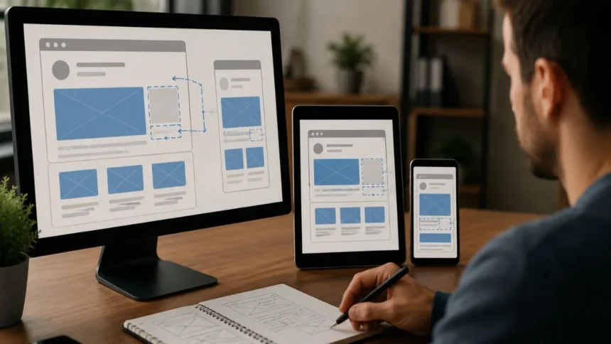
Have you ever tried to click a button only for the page to move at the last second? Perhaps an advertisement suddenly appeared, an image pushed the text downward, or a notification banner shifted the entire screen. These unexpected movements are examples of layout instability, and they can make an otherwise attractive website feel frustrating, unreliable, and difficult to use.
Cumulative Layout Shift, commonly known as CLS, is a Core Web Vitals metric that measures the visual stability of a webpage. It helps website owners understand how often visible content unexpectedly changes position while a person is browsing. A low CLS score means the page remains stable, while a high score suggests that visitors may experience disruptive movement.
Improving CLS is not only about achieving a better performance score. Stable layouts help readers maintain their position, allow shoppers to select the correct product, and prevent visitors from clicking the wrong link or button. Visual stability can therefore influence user confidence, engagement, accessibility, conversions, and the overall quality of a website experience.
This guide explains what Cumulative Layout Shift is, how the metric is calculated, what causes poor CLS, and how to improve it. It also covers PageSpeed Insights, Chrome DevTools, image dimensions, advertisement slots, web fonts, dynamic content, CSS animations, WordPress optimization, and practical monitoring techniques.
What Is Cumulative Layout Shift?
Cumulative Layout Shift measures unexpected movement among visible elements on a webpage. A layout shift occurs when an element changes its starting position between two rendered frames. For example, a paragraph may move downward when an image loads above it, or a button may move sideways when a custom font changes the width of nearby text.
CLS does not simply add every movement that happens during a page visit. The metric measures the largest burst of unexpected layout shifts, known as a session window. A session window contains shifts occurring less than one second apart and can last for a maximum of five seconds.
This session-based calculation prevents long pages from receiving an unfairly high score merely because someone keeps the page open for an extended period. The browser evaluates groups of related shifts and uses the highest-scoring group as the page’s CLS value. This approach better represents the most disruptive period experienced by the visitor.
CLS is a unitless score rather than a measurement in seconds or milliseconds. It represents both how much of the viewport was affected and how far unstable elements moved. The final number provides a consistent way to compare visual stability across pages, devices, templates, and user sessions.
Why Cumulative Layout Shift Matters to Real Users
Unexpected movement interrupts the task a visitor is trying to complete. A reader may lose their place in an article, a customer may select the wrong checkout option, or a mobile user may tap an advertisement instead of the navigation link they intended to open. These experiences can quickly reduce trust in a website.
Layout instability can be particularly harmful on ecommerce, financial, medical, and transactional pages. A shifting interface may cause someone to change a quantity, submit the wrong form, or accidentally confirm an action. Even when the mistake has no serious consequence, the visitor must spend additional time correcting it.
Stable pages are also easier to understand and navigate. Users can scan headings, follow instructions, complete forms, and interact with controls without constantly adjusting to moving content. A predictable interface reduces cognitive effort and creates a calmer experience, especially for people using touchscreens or assistive technologies.
Google includes CLS among the three Core Web Vitals used to evaluate loading performance, responsiveness, and visual stability. Google recommends achieving good Core Web Vitals for search success and user experience, although CLS should be considered alongside content quality, relevance, security, mobile usability, and other page-experience factors.
How Is a CLS Score Calculated?
An individual layout shift score is calculated by multiplying the impact fraction by the distance fraction. The impact fraction represents how much of the visible viewport was affected by unstable elements. The distance fraction represents how far the element moved compared with the viewport’s largest dimension.
Imagine that a late-loading image pushes a large block of text downward. If the text occupies a significant portion of the screen, the impact fraction will be relatively high. If the text also moves a considerable distance, the distance fraction increases, resulting in a larger layout shift score.
The simplified formula is: layout shift score equals impact fraction multiplied by distance fraction. A movement affecting 75% of the viewport with a distance fraction of 25% would produce a shift score of 0.1875. Larger affected areas and longer movement distances therefore create more serious CLS problems.
You do not need to calculate every shift manually when optimizing a website. PageSpeed Insights, Chrome DevTools, Lighthouse, the Chrome User Experience Report, and the Web Vitals JavaScript library can measure CLS automatically. Understanding the formula is still valuable because it explains why a small movement involving a large element can be highly disruptive.
What Is a Good CLS Score?
A good CLS score is 0.1 or less. A score above 0.1 and up to 0.25 is classified as needing improvement, while a score above 0.25 is considered poor. These thresholds give website owners a practical framework for prioritizing visual-stability problems.
Google recommends assessing the 75th percentile of page visits, separated between mobile and desktop users. In practical terms, at least 75% of visits should experience a CLS score of 0.1 or better. A single fast laptop test is therefore not enough to demonstrate that most visitors receive a stable experience.
Mobile and desktop scores may differ because layouts, advertisements, fonts, navigation systems, and responsive images can behave differently. A desktop page may remain stable while its mobile version experiences movement from a collapsing menu, sticky advertisement, or text wrapping caused by a narrower viewport.
Do not treat 0.1 as a reason to ignore smaller improvements. A page scoring 0.09 may technically pass while still containing a noticeable shift in an important interaction. Performance thresholds are useful targets, but the best final test is whether users can read and interact without unexpected movement.
Expected and Unexpected Layout Shifts
Not every movement on a webpage is harmful. When a visitor opens an accordion, expands a menu, selects a filter, or requests additional results, content may need to move. These changes are generally acceptable when they happen immediately after an intentional action and clearly match what the visitor expected.
Layout shifts occurring within 500 milliseconds of certain user inputs may be excluded from CLS calculations through the hadRecentInput property. This treatment applies to discrete actions such as clicks, taps, and key presses. Continuous gestures such as scrolling, dragging, or pinch-to-zoom are handled differently.
However, a delayed response can still become an unexpected shift. Suppose a person clicks “Show more,” but the application waits several seconds for a network request before inserting new content above the current position. The connection between the action and the movement may no longer feel clear.
Reserve space or show a loading placeholder immediately when an interaction requires delayed content. This approach communicates that the page is responding and prevents existing elements from being displaced when the result arrives. A useful interface should feel predictable even when network or server processing takes time.
The Most Common Causes of Poor CLS
Images and videos without defined dimensions are among the most common causes of layout shifts. When the browser does not know how much space a media element will require, it may initially render surrounding content without that space. Once the file loads, the browser must move nearby elements to make room.
Advertisements, iframes, social posts, maps, and video embeds create similar problems. Their final size may not be known when the initial layout is calculated. Dynamic ad sizes can be especially difficult because the creative selected by an advertising network may vary between users and page visits.
Web fonts can create movement when fallback text is replaced with a font that has different character widths, line heights, or spacing. A heading may wrap onto another line, a button may become wider, or several paragraphs may change height when the final typeface appears.
Other common CLS causes include notification banners, cookie notices, recommendation widgets, personalized content, injected forms, consent managers, expandable promotions, and client-side applications. Google identifies unsized images, ads, embeds, dynamically inserted content, and web fonts as leading sources of poor visual stability.
Measure CLS With Field Data and Lab Data
Field data measures the experiences of real visitors using different devices, networks, locations, and browsing conditions. PageSpeed Insights can display field data from the Chrome User Experience Report when sufficient information is available. Google Search Console also groups similar URLs according to their real-world Core Web Vitals performance.
Field results are particularly important for CLS because layout movement can occur throughout the life of a page. Personalized content, advertisements, delayed API responses, and user interactions may create shifts that do not appear during a short automated page-load test.
Lab data is collected in a controlled environment through tools such as Lighthouse and Chrome DevTools. It is useful for reproducing problems, examining individual shifts, and evaluating a change before deployment. However, laboratory tools may report a lower CLS value because they commonly observe only part of the user journey.
Use field data to determine whether real visitors have a problem, then use lab tools to diagnose the likely cause. If field CLS is poor but Lighthouse reports no issue, investigate post-load behavior such as carousels, advertisements, lazy-loaded sections, sticky elements, consent banners, and delayed application updates.
Find Layout Shifts in Chrome DevTools
Chrome DevTools can show which elements moved and when the movement occurred. Open the Performance panel, record a page load or interaction, and review the Layout Shifts track. Individual shifts appear on the timeline and are grouped into clusters according to their proximity.
Begin with the largest layout-shift cluster because it contributes the most to the CLS score. Selecting a cluster displays its timing, score, affected elements, and potential causes. The accompanying screenshots can help you see how the page looked before and after the movement.
The Rendering panel also includes a Layout Shift Regions option. When enabled, Chrome highlights unstable areas as the page loads and changes. This visual overlay is useful when the movement happens quickly and is difficult to identify by watching the page normally.
Test more than the initial page load. Scroll through the page, open menus, accept or reject cookies, activate filters, wait for advertisements, and interact with forms. Chrome’s Performance panel can capture live CLS information, including layout-shift elements, timings, and scores during the testing session.
Set Image and Video Dimensions
Always provide width and height attributes for images whenever possible. These values allow the browser to calculate an aspect ratio and reserve the correct amount of space before the image finishes downloading. The image can still be resized responsively through CSS without creating unnecessary movement.
A common responsive pattern is to define the intrinsic width and height in HTML while using max-width: 100% and height: auto in CSS. The browser understands the original proportions, and the design allows the image to scale according to the available container width.
Responsive images using the picture element may require extra care when different sources use different aspect ratios. Define suitable dimensions for each source where supported, or ensure that the container maintains the intended aspect ratio across breakpoints. Testing narrow and wide screens can reveal shifts that appear only at particular viewport sizes.
The same principle applies to videos, thumbnails, product galleries, maps, and poster images. Use an aspect-ratio container when the exact rendered size depends on responsive design. Reserving space before media loads is one of the simplest and most effective ways to improve CLS.
Reserve Space for Ads, Embeds, and Iframes
Advertising slots should have a reserved area before an advertisement is requested. Without a predefined container, the selected creative can push articles, products, or navigation controls downward. This movement is especially disruptive when the advertisement appears near the top of the viewport.
The exact advertisement size may vary, so reserve enough space for the most likely dimensions. A min-height can protect the surrounding layout while still permitting approved responsive sizes. Avoid collapsing an empty slot after the page has loaded because removing the container may create another shift.
Embeds such as maps, videos, reviews, social-media posts, and external forms should also use fixed dimensions or aspect-ratio containers. A lightweight placeholder can occupy the required space until the third-party content loads or the visitor chooses to activate it.
When you cannot control the content inside a third-party iframe, focus on controlling its outer container. Ensure that the integration does not repeatedly resize after rendering. Ads, embeds, and dynamically injected widgets are major contributors to poor CLS because their dimensions are often unavailable during the initial layout.
Prevent Dynamic Content From Pushing the Page Down
Avoid inserting new content above existing visible content unless the user directly requested the change. Promotional banners, newsletter boxes, app-install prompts, alerts, and recommendation modules can cause severe layout shifts when added near the top of a page after loading.
Reserve a container for dynamic content when you know it may appear. Skeleton screens and placeholders can preserve the expected layout while an API request is processed. The placeholder should closely match the dimensions of the final content to prevent movement when the real information replaces it.
Cookie notices and consent banners should be planned as part of the initial interface. An overlay that does not change the document flow may reduce CLS, although it must remain accessible and should not hide important content. Alternatively, reserve the banner’s space before the first render.
Personalized content should follow the same principle. If a greeting, offer, recommendation, or account panel may vary between visitors, design a stable area capable of containing the likely versions. Visual stability improves when personalization changes content within an established container instead of changing the entire page structure.
Optimize Web Fonts to Reduce Text Movement
Font swapping can change the size and shape of text after the first render. When the fallback font and custom web font have different metrics, paragraphs may gain or lose lines, headings may wrap differently, and buttons may change width. These changes can move large portions of a page.
Use fewer font families, styles, and weights so the browser has less typography to download and process. Preload only the most important font files required for visible content. Preloading every available weight can compete with critical resources and may not improve visual stability.
Choose fallback fonts with proportions similar to the final font. Modern CSS font metric overrides, including size-adjust, ascent-override, descent-override, and line-gap-override, can help align a fallback typeface with the downloaded font. The goal is to make the initial and final text occupy nearly identical space.
Select an appropriate font-display strategy after considering both visibility and movement. A system font may provide the most stable experience, while a carefully configured custom font can preserve branding without disruptive reflow. Test typography on slow connections because locally cached fonts may hide the problem during development.
Handle Popups, Banners, and Sticky Elements Carefully
Popups and overlays do Elements Carefully
Pop not always contribute directly to CLS because they may sit above the existing layout rather than move it. However, implementations that add margins, change container heights, remove scrollbars, or push the page downward can create noticeable visual instability.
Announcement bars should either have space reserved from the beginning or appear as accessible overlays. Inserting a bar above the header after a delay forces every visible element downward. The effect becomes more disruptive when the visitor is already reading or preparing to click a navigation control.
Sticky headers can cause movement if their height changes after scrolling. A logo may shrink, navigation may wrap, or a promotional strip may disappear while other content changes position. Use stable dimensions and animate visual properties without repeatedly recalculating the document layout.
Test banners in several languages, viewport widths, and zoom levels. Text that fits on one line in English may wrap to two or three lines in another language or on a narrow phone. Reserving insufficient space can recreate the CLS problem even when the default version appears stable.
Use Stable CSS Animations and Transitions
Animations can help users understand changes, but they should not repeatedly alter document geometry. Animating width, height, top, left, margins, or padding can cause layout calculations and move surrounding elements. These movements may contribute to visual instability.
Prefer compositor-friendly properties such as transform and opacity for motion and visual transitions. Use transform: translate() to move an element and transform: scale() to resize it visually when appropriate. These properties can animate without changing the normal position . citeturn119102view0
An animation should still communicate a clear relationship between the visitor’s action and the result. Avoid automatic motion that unexpectedly covers controls or changes the reading position. Respect the prefers-reduced-motion setting to support users who experience discomfort or difficulty from animated interfaces.
Remember that a smooth animation is not automatically a stable layout. If an animated element ultimately occupies new space in the document, nearby content may still move after the transition. Reserve the final space or place the animated element in a separate layer that does not disturb the surrounding flow.
Improve CLS on Single-Page Applications
Single-page applications can accumulate layout shifts long after the first view has loaded. Route changes, delayed components, authentication checks, personalized dashboards, and client-side data requests may all modify visible content without a complete page refresh.
Use route-level skeletons that match the dimensions of the final components. Avoid replacing a small loading message with a much larger interface because the surrounding page will move when the application finishes rendering. Stable loading states should imitate the structure of the expected result.
Preserve container heights when switching between tabs, steps, or filtered views where practical. If content sizes vary significantly, place updates below the current viewport or animate the transition intentionally. Immediate visual feedback can also clarify that the change follows a user action.
Monitor CLS across the entire page lifecycle rather than stopping after initial rendering. Real-user monitoring with the Web Vitals library can reveal shifts caused by later interactions and long sessions. Field measurement is important because laboratory tests may not reproduce every route, state, or. citeturn119102view0
Use the Back/Forward Cache to Support Visual Stability
The browser’s back/forward cache, commonly called bfcache, can preserve a fully rendered page in memory when a visitor navigates away. If the visitor returns using the back or forward button, the browser may restore the previous page immediately instead of rebuilding it from the beginning.
A restored page can avoid repeating layout shifts that occurred during the initial load. This is particularly useful on search results, product categories, article indexes, and other pages that users frequently revisit after opening an individual item.
Bfcache does not excuse poor initial CLS, because first-time visitors may still encounter unstable content. It should be viewed as an additional way to improve return-navigation experiences while the underlying causes of layout movement are addressed.
Review whether important templates are eligible for bfcache and remove unnecessary blockers when possible. Google’s CLS optimization guidance identifies bfcache eligibility as an effective way to reduce repeated layout shifts during back citeturn574712search8
How to Improve CLS on WordPress
WordPress layout shifts commonly come from themes, page builders, advertisements, sliders, cookie plugins, font loaders, image galleries, and delayed widgets. Begin by identifying the moving element rather than installing several optimization plugins without understanding the cause.
Ensure that WordPress outputs width and height attributes for featured images, thumbnails, product photographs, and gallery media. Modern responsive image markup should preserve aspect ratios, but custom themes or older plugins may remove dimensions or override them incorrectly.
Configure advertisement, video, review, and form plugins to reserve space for their output. Test popup and consent tools carefully because they may insert banners above the header or modify the body after rendering. Remove abandoned plugins and scripts that create dynamic content without business value.
Use a staging website to test font-display settings, critical CSS, lazy loading, caching, and theme changes. Do not combine several plugins that perform overlapping optimizations, as conflicting settings can create new movement. Validate important templates on mobile and desktop before deploying changes.
Build a Practical CLS Improvement Workflow
Start by reviewing field data in PageSpeed Insights and the Core Web Vitals report in Google Search Console. Identify important URL groups marked Poor or Needs Improvement, then select representative pages from each template. Record their mobile and desktop CLS scores before changing the website.
Reproduce the problem in Chrome DevTools and begin with the largest layout-shift cluster. Determine which element moved and which late-loading resource or script caused the movement. The unstable element is not always the root cause; content appearing above it may be responsible.
Apply the smallest targeted fix first. Add image dimensions, reserve an advertisement slot, stabilize a font, adjust a dynamic container, or replace a layout-changing animation. Retest the page under throttled conditions and interact with it beyond the initial load.
Deploy validated improvements and monitor real-user data over time. CrUX-based field reports use a rolling collection period, so changes may not appear immediately. Continue checking for regressions whenever themes, advertisements, plugins, campaigns, fonts, or third-party tools are introduced.
Common CLS Optimization Mistakes to Avoid
Do not assume that the element shown as moving is necessarily the element causing the problem. A paragraph may be identified as unstable even though an advertisement, image, or banner above it created the movement. Always inspect the sequence of events around the shift.
Avoid adding fixed heights without considering responsive content. A container that is large enough on desktop may be too small for mobile text, translated copy, or accessibility zoom. Use aspect ratios, minimum heights, and flexible layouts that reserve adequate space without clipping content.
Do not focus only on the homepage. Product pages, articles, category templates, landing pages, and logged-in dashboards may use different advertisements, widgets, fonts, or layouts. Search Console URL groups can help identify patterns that are not visible in a single manual test.
Finally, do not remove useful information merely to achieve a lower score. The goal is to deliver valuable content through a stable interface, not to create an empty page that performs well in a test. Preserve functionality while improving when, where, and how content appears.
Does CLS Affect SEO?
CLS is one of Google’s Core Web Vitals and contributes to the broader evaluation of page experience. Google encourages website owners to achieve good Core Web Vitals for both search success and overall usability. A stable page can support the kind of experience Google’s ranking citeturn574712search1
However, a good CLS score does not guarantee a top ranking. Google evaluates many signals, including relevance, helpfulness, originality, links, usability, security, and whether the page satisfies the searcher’s intent. Technical performance supports strong content but does not replace it.
CLS can also influence SEO indirectly through user behavior. Visitors who encounter shifting content may abandon the page, avoid interacting, or lose confidence in the website. A stable interface makes it easier for people to consume the content and complete the action associated with the page.
Treat CLS improvement as part of a complete technical SEO and user-experience strategy. Combine visual stability with fast loading, responsive interactions, accessible design, secure delivery, clear navigation, and people-first content. The strongest website experience is created when performance and usefulness support each other.
Create a Stable Experience Instead of Chasing a Score
Cumulative Layout Shift measures whether visible content remains where users expect it to remain. A score of 0.1 or less is considered good, while values above 0.25 are poor. The most meaningful goal is not the number alone but the frustration or confidence that the number represents.
Begin by measuring real-user data and reproducing the largest shifts in Chrome DevTools. Look for images without dimensions, unstable advertisements, late embeds, mismatched web fonts, injected banners, dynamic components, and layout-changing animations. Fix the underlying cause rather than hiding the visible symptom.
Most improvements follow one simple principle: reserve the correct amount of space before content arrives. When that is not possible, keep changes close to deliberate user actions and provide immediate loading feedback. Stable placeholders and predictable containers allow the interface to change without surprising the visitor.
A visually stable website feels polished, trustworthy, and easier to use. By monitoring CLS across important templates and reviewing new features before launch, you can prevent performance regressions while supporting stronger user engagement, accessibility, conversions, and search visibility.
Frequently Asked Questions
What does Cumulative Layout Shift measure?
CLS measures unexpected movement of visible webpage elements during a page visit. It helps determine whether content remains visually stable while images, fonts, ads, and dynamic components load.
What is considered a good CLS score?
A CLS score of 0.1 or less is considered good. Scores between 0.1 and 0.25 need improvement, while scores above 0.25 are classified as poor.
Why is my CLS score higher on mobile?
Mobile layouts use narrower viewports, slower devices, responsive advertisements, and different text wrapping. These conditions can expose shifts that may not appear during desktop testing.
Do lazy-loaded images cause layout shifts?
Lazy loading itself does not have to cause CLS. Layout shifts occur when the browser has not reserved space for the image, so dimensions or a stable aspect-ratio container should be provided.
How long does it take for CLS improvements to appear?
Lab-tool improvements may appear immediately after a fix. Field reports such as PageSpeed Insights and Search Console update gradually because they depend on collected real-user visits.